VW.com
VP Digital Design
VP Digital Design
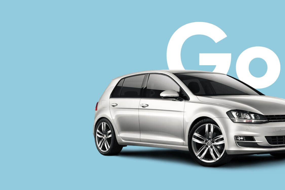
A simpler way to car shop
Overwhelming with corporate jargon and technical lists, VW's site was fast becoming a riddle to understand and a maze to navigate.
We began the overhaul of VW.com by restarting with human insights, needs, and desires—to create a simpler, more approachable, and useful experience for car shoppers.

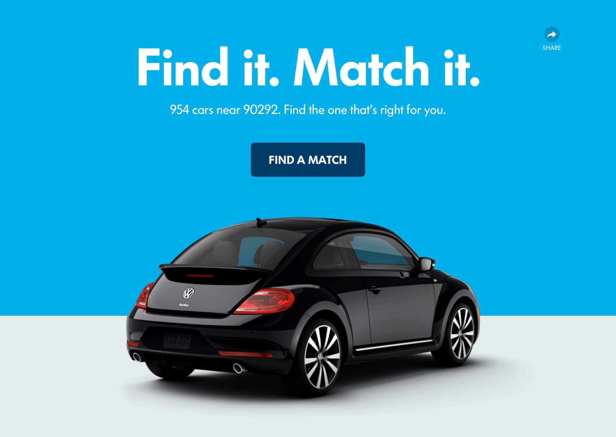
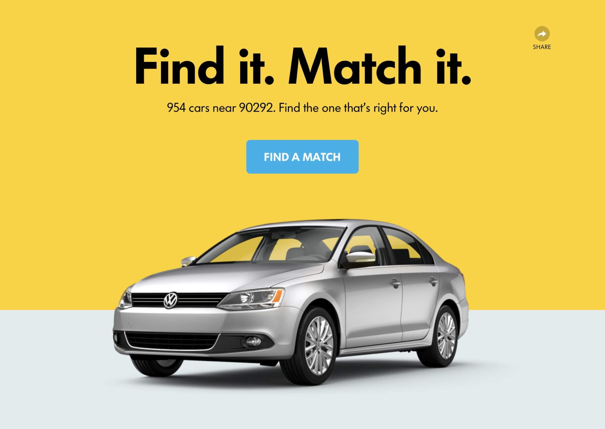
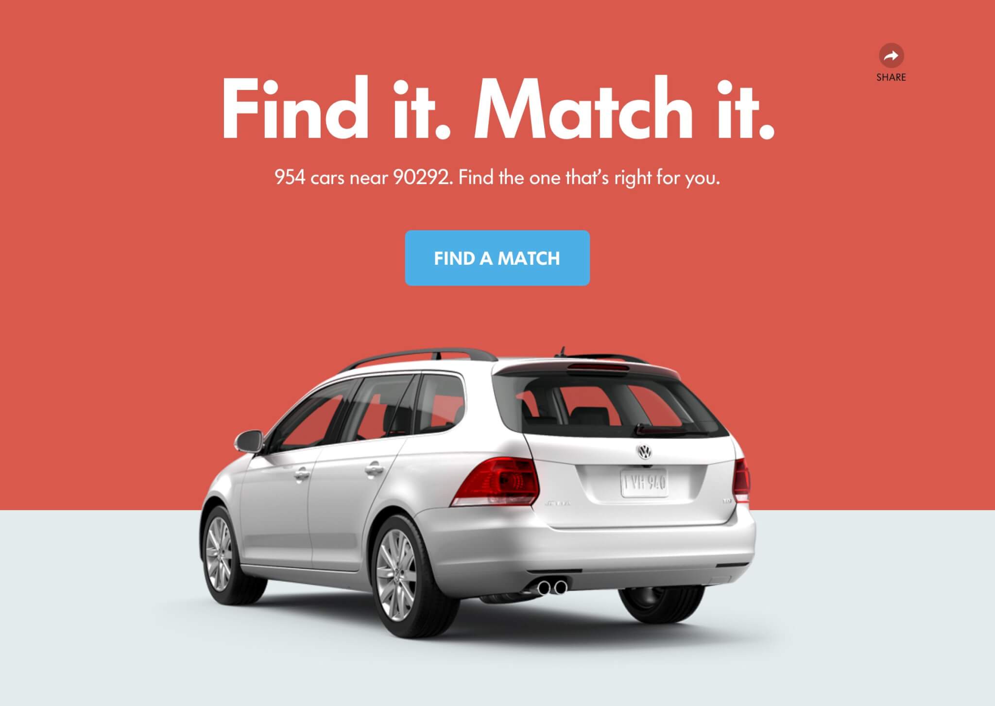
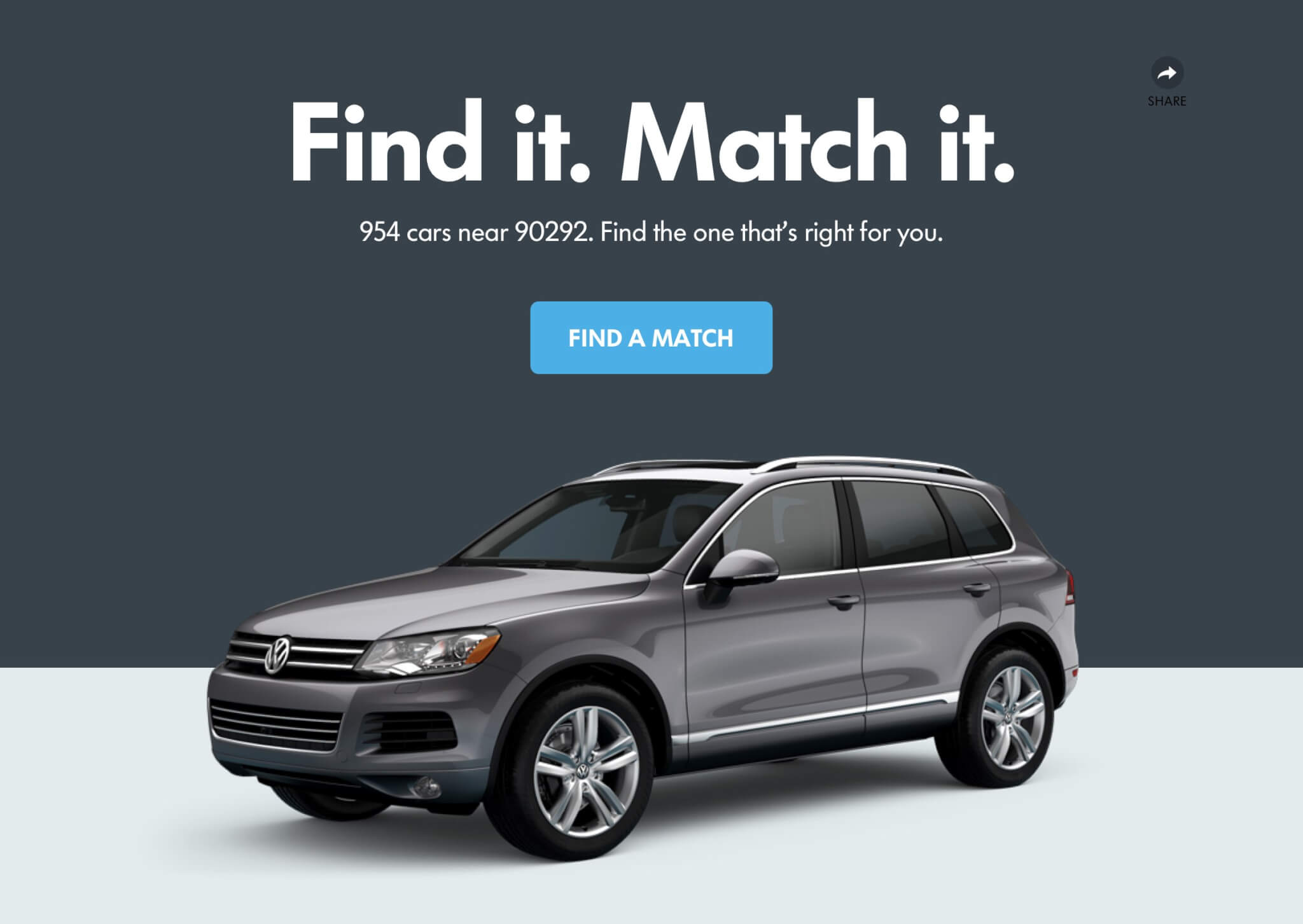
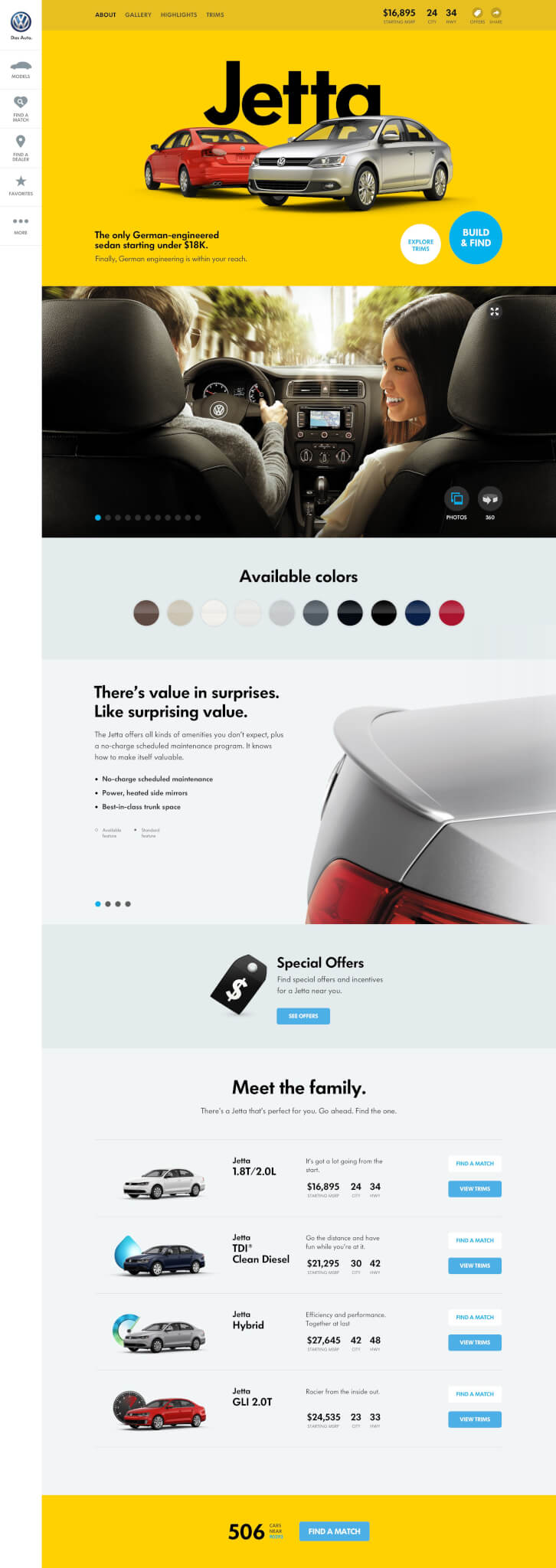
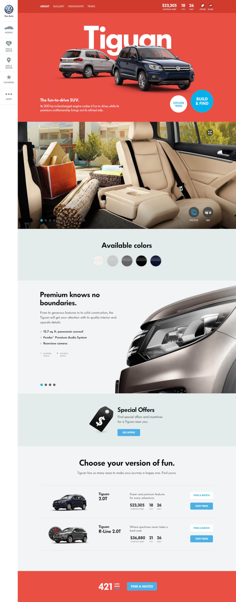
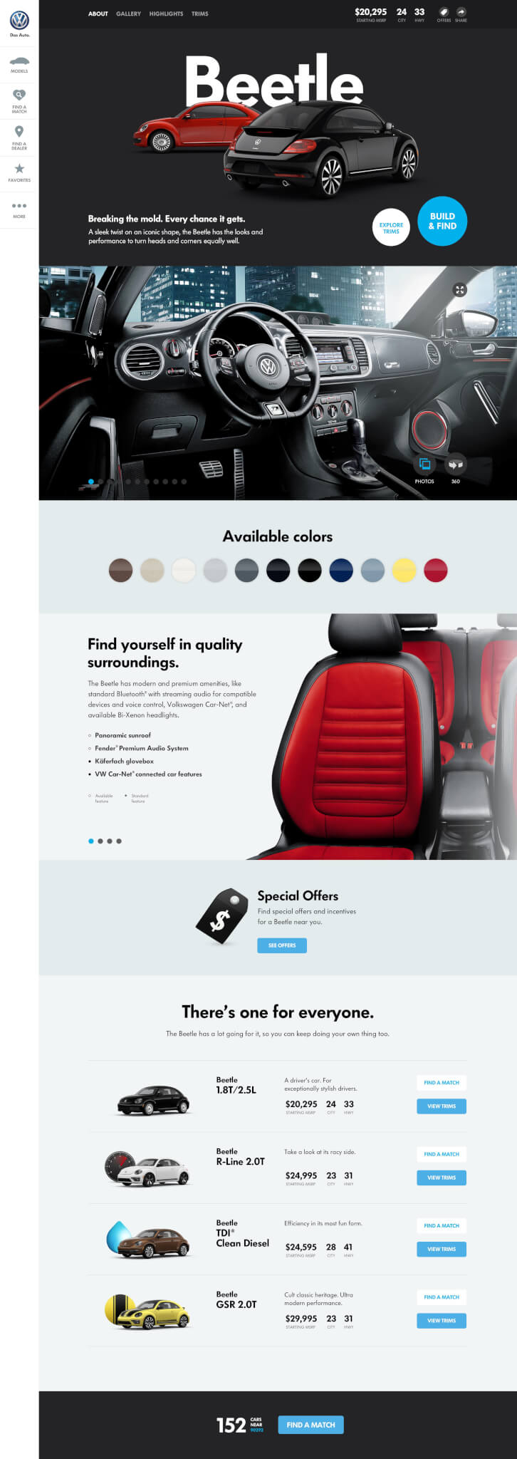
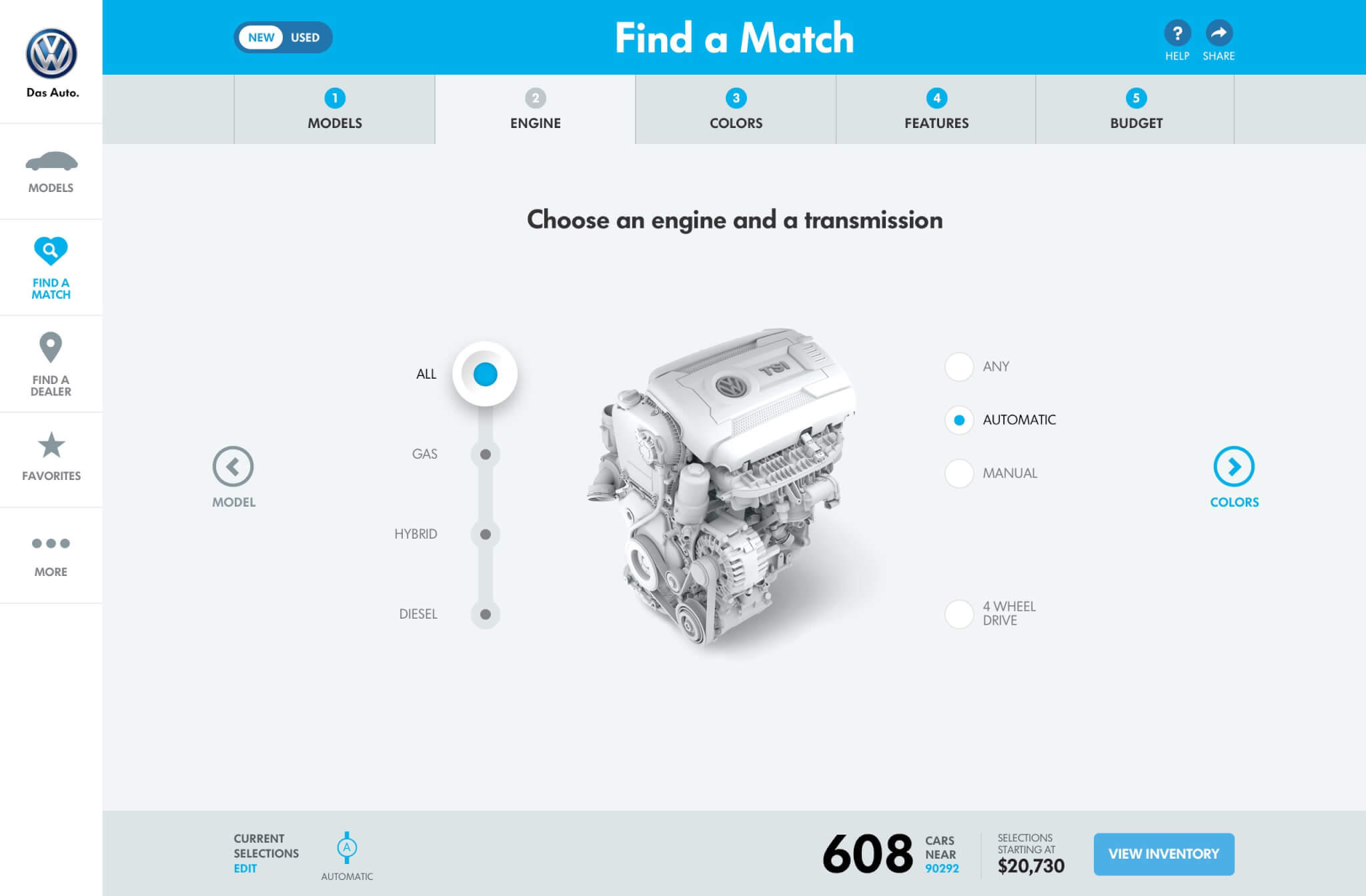
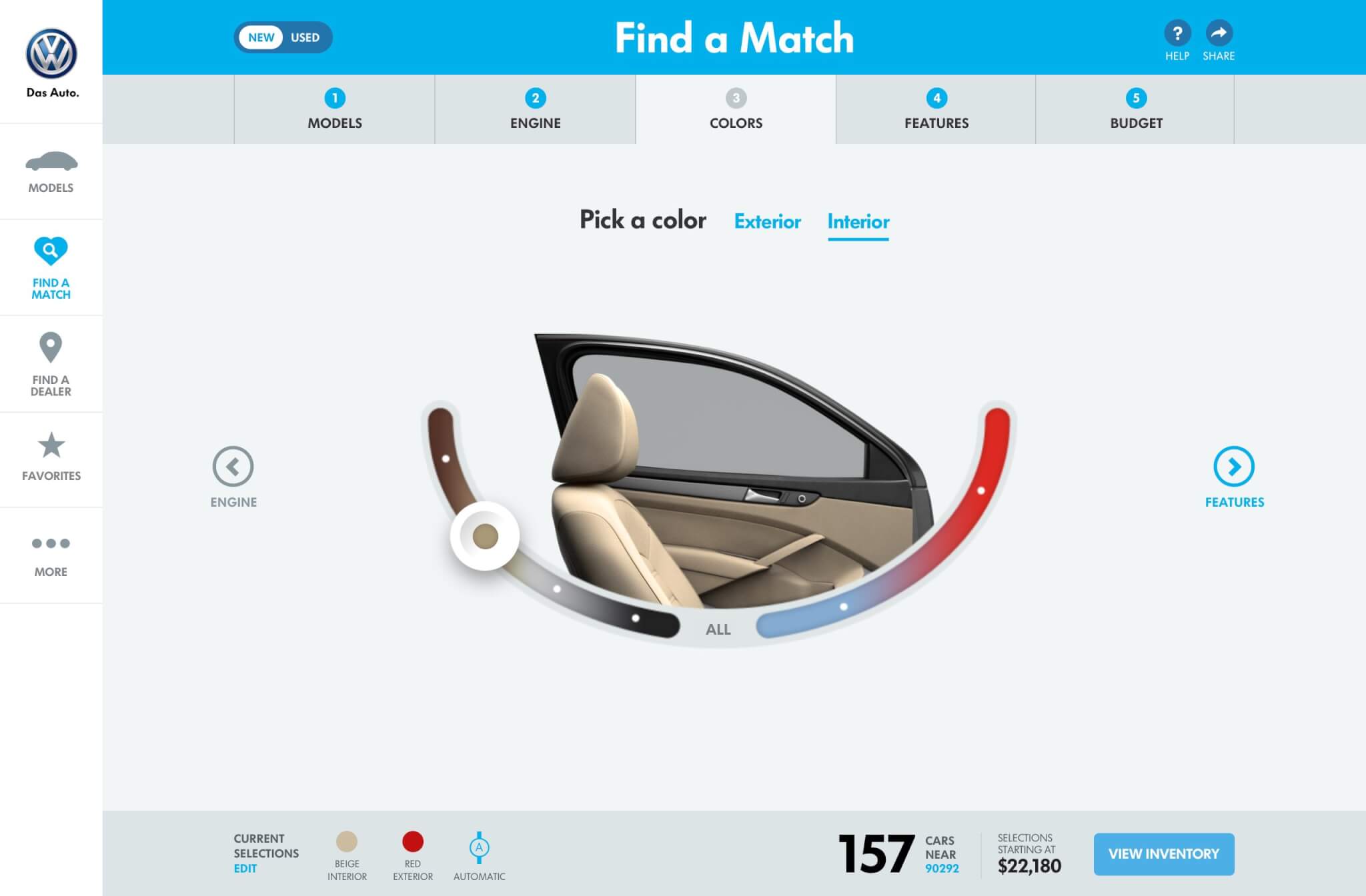
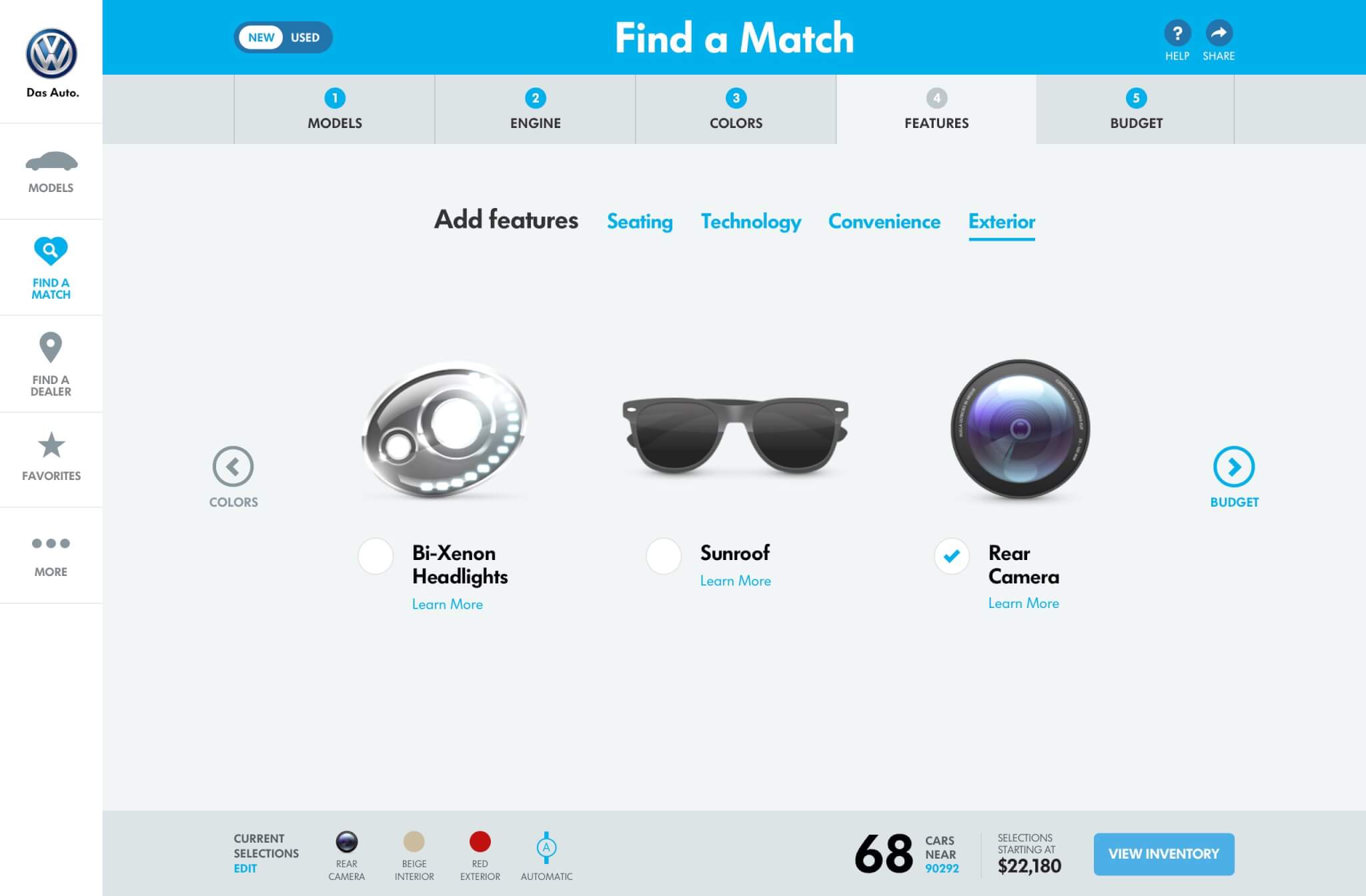
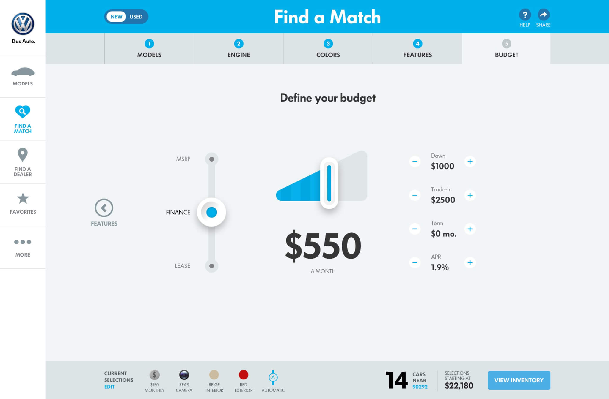
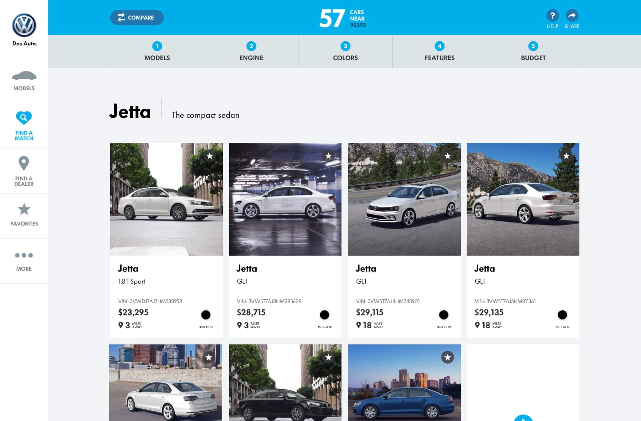
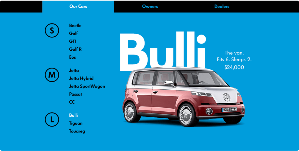
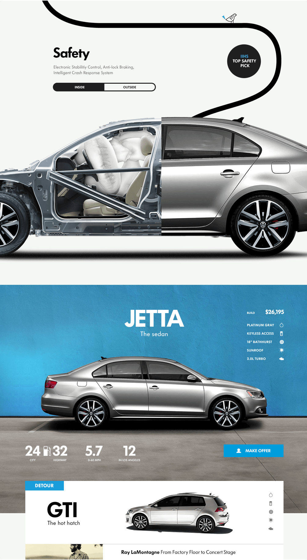
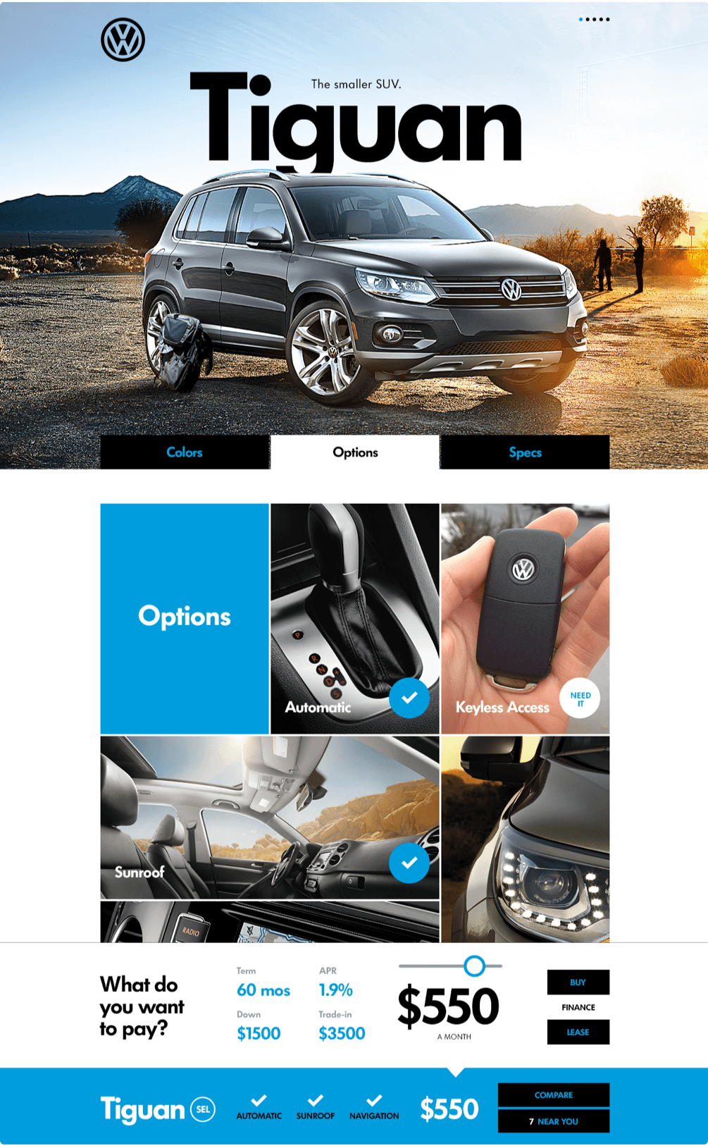
Focus on simplification led to the core feature: Find a Match, where people can quickly pare down choice through the things they want: by size, color, feature, or price.
Coupled directly to live inventory, the site helps car buyers understand VW’s lineup, pick the perfect car, and find it within their neighborhood in one go.
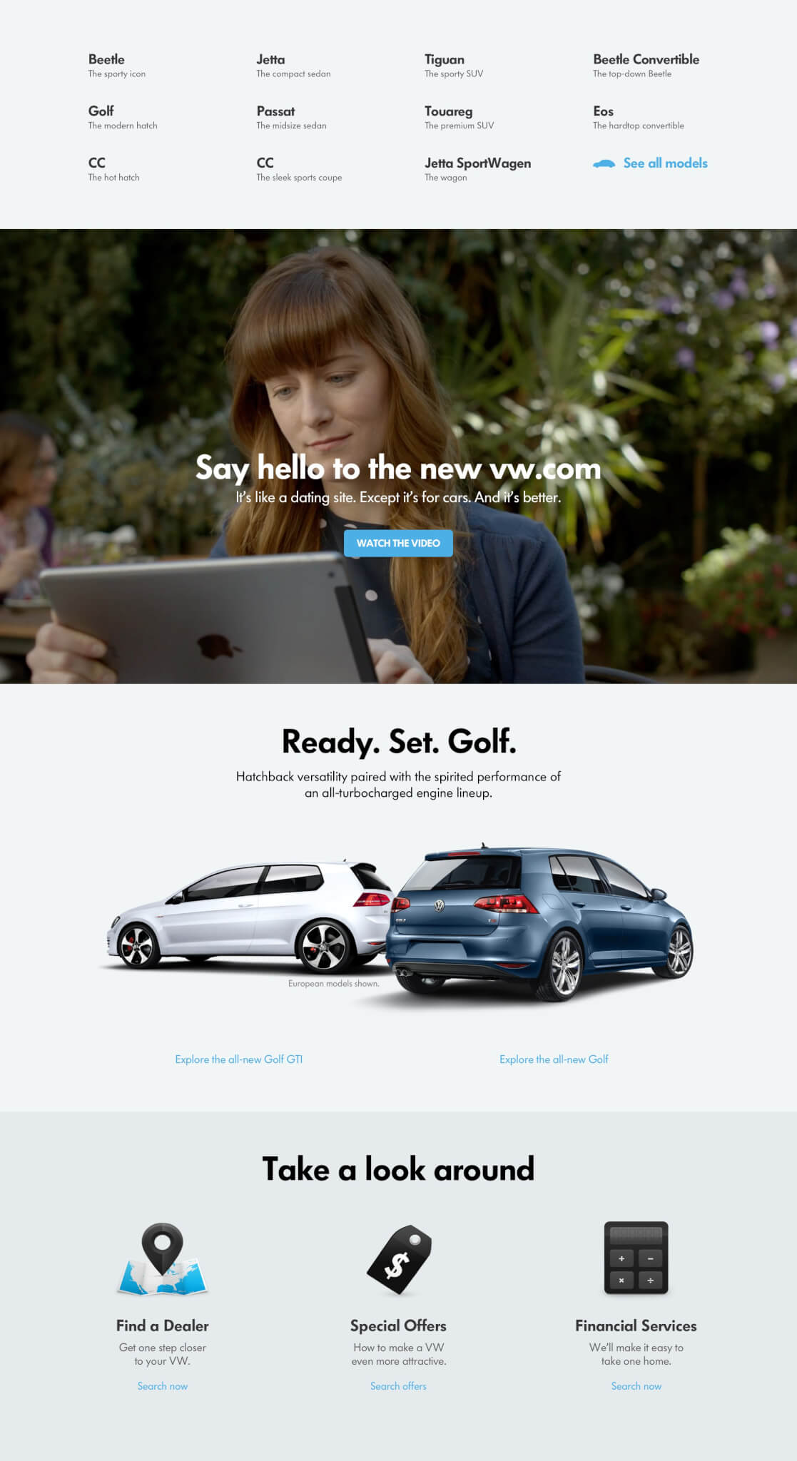
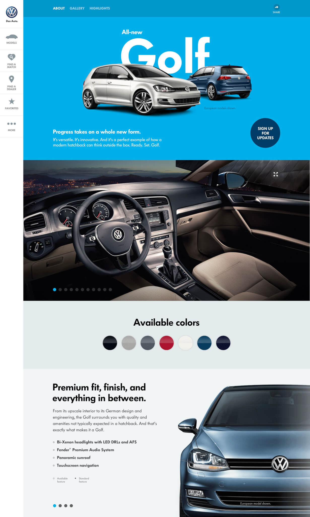
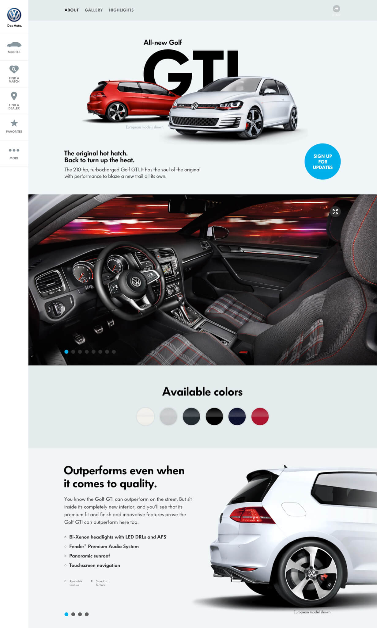
We developed a friendly design language featuring touch-first UI, bold typography, inviting colorways, form-highlighting product imagery, and easy-to-understand labels.


VW.COM
VW.COM
MODEL BUCKET PAGE
MODEL PAGE
FIND A MATCH
INVENTORY
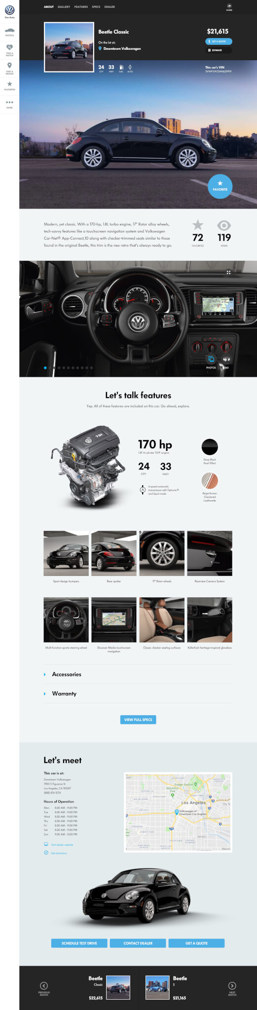
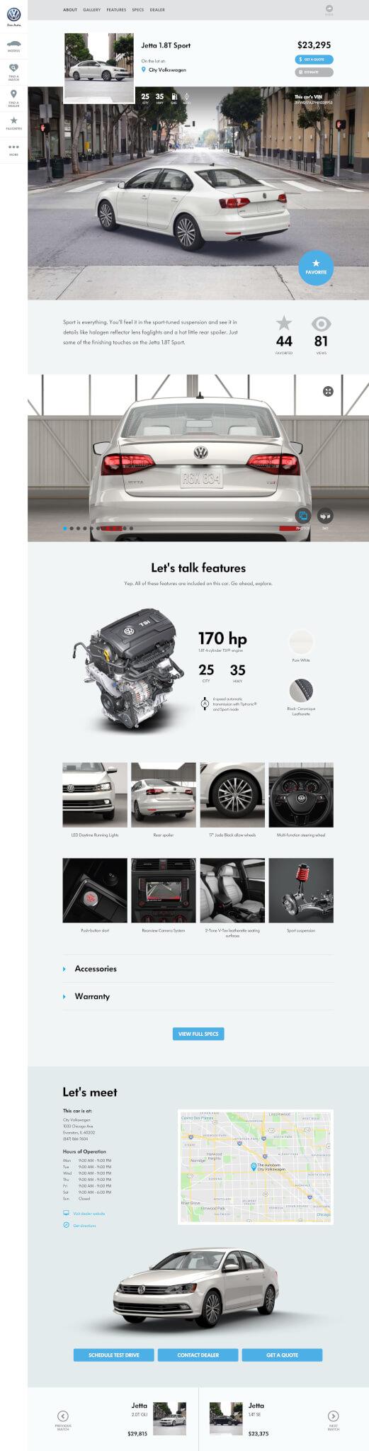
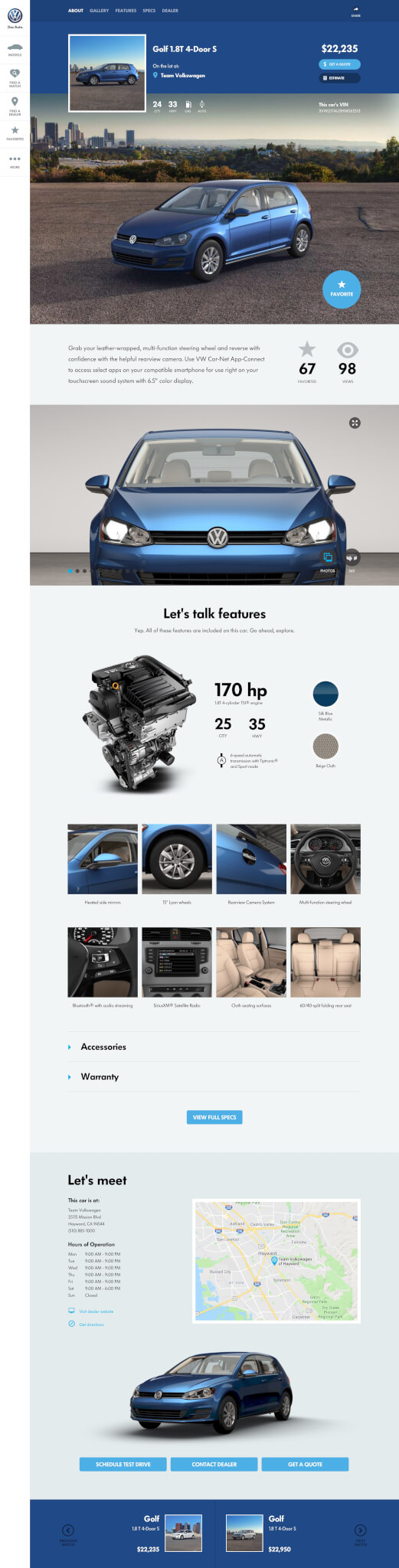
VEHICLE PROFILE PAGE
PROFILE PAGE
Vision
Vision
From principles to product, these are the ideas, concepts, and experiments that led to the redesign of VW.com.
SIMPLE SIZE
COLORIZE
DETOUR
DETOUR
DETOUR
DETOUR
DETOUR
GLOVEBOX
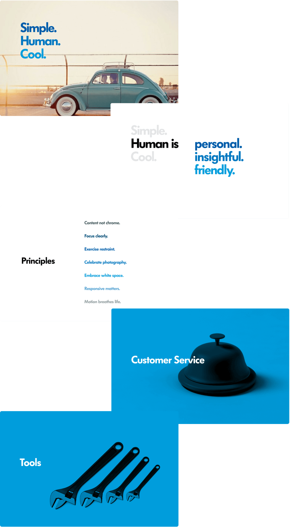
PRINCIPLES
First Gen
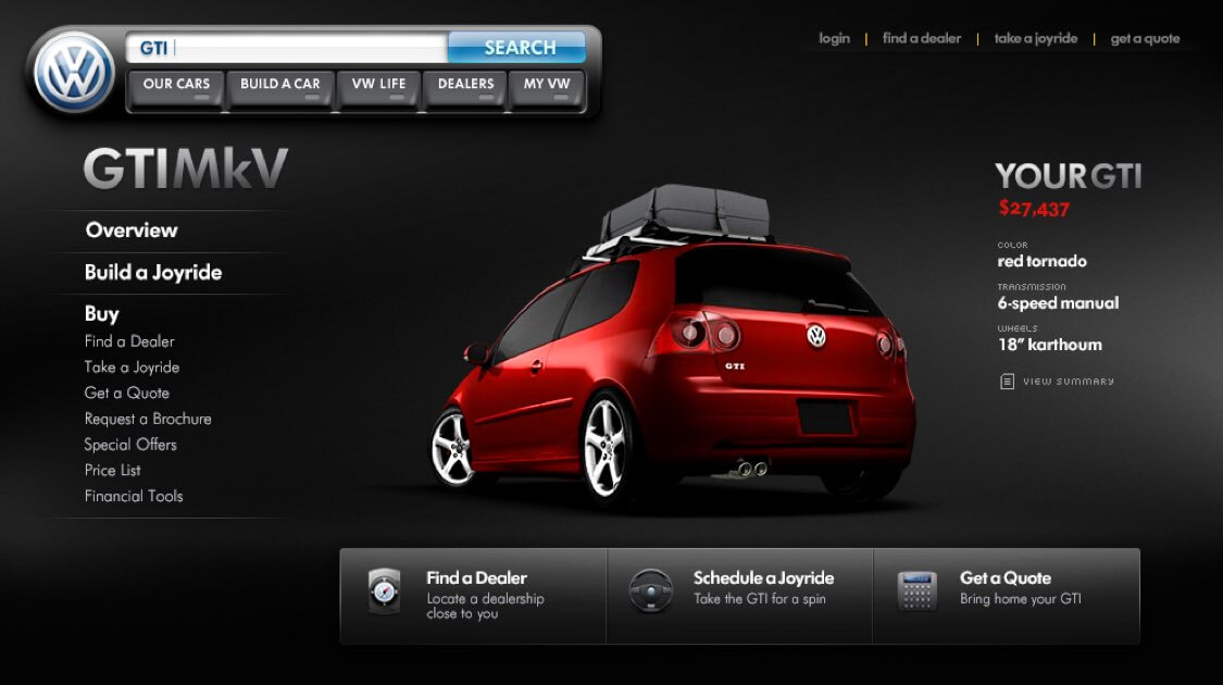
I've redesigned VW.com twice. The first one was two platform generations earlier. It featured a search-driven widget to center users with instant navigation and discovery of content.
I've redesigned VW.com twice. The first one was two platform generations earlier. It featured a search-driven widget to center users with instant navigation and discovery of content.
I've redesigned VW.com twice. The first one was two platform generations earlier. It featured a search-driven widget to center users with instant navigation and discovery of content.

Next
Next
Next
Next
Next
